Greetings.
Is it possible to return the old color scheme?
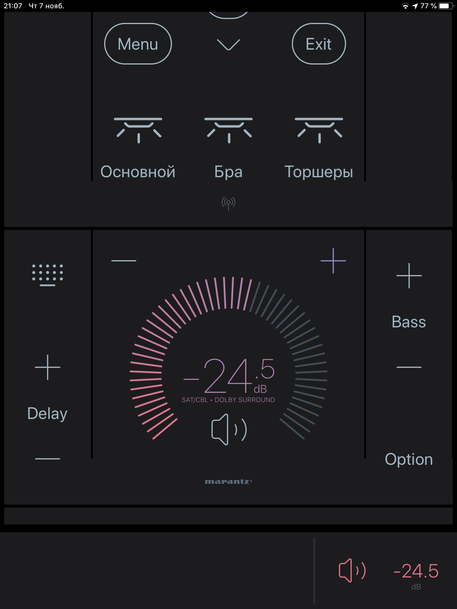
Look at how in the old version everything was clear, beautiful and comfortable …
Old scheme:
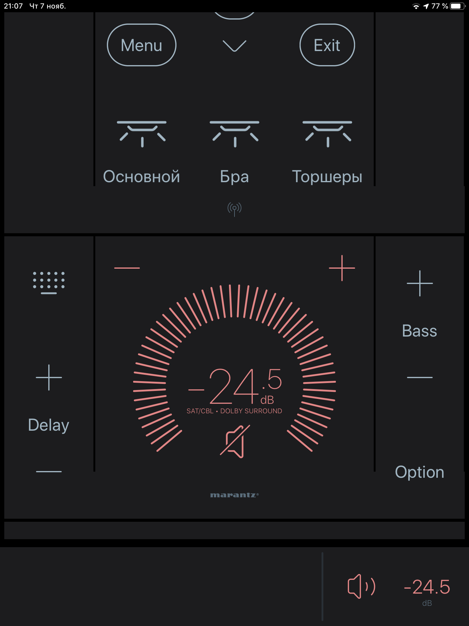
New scheme:
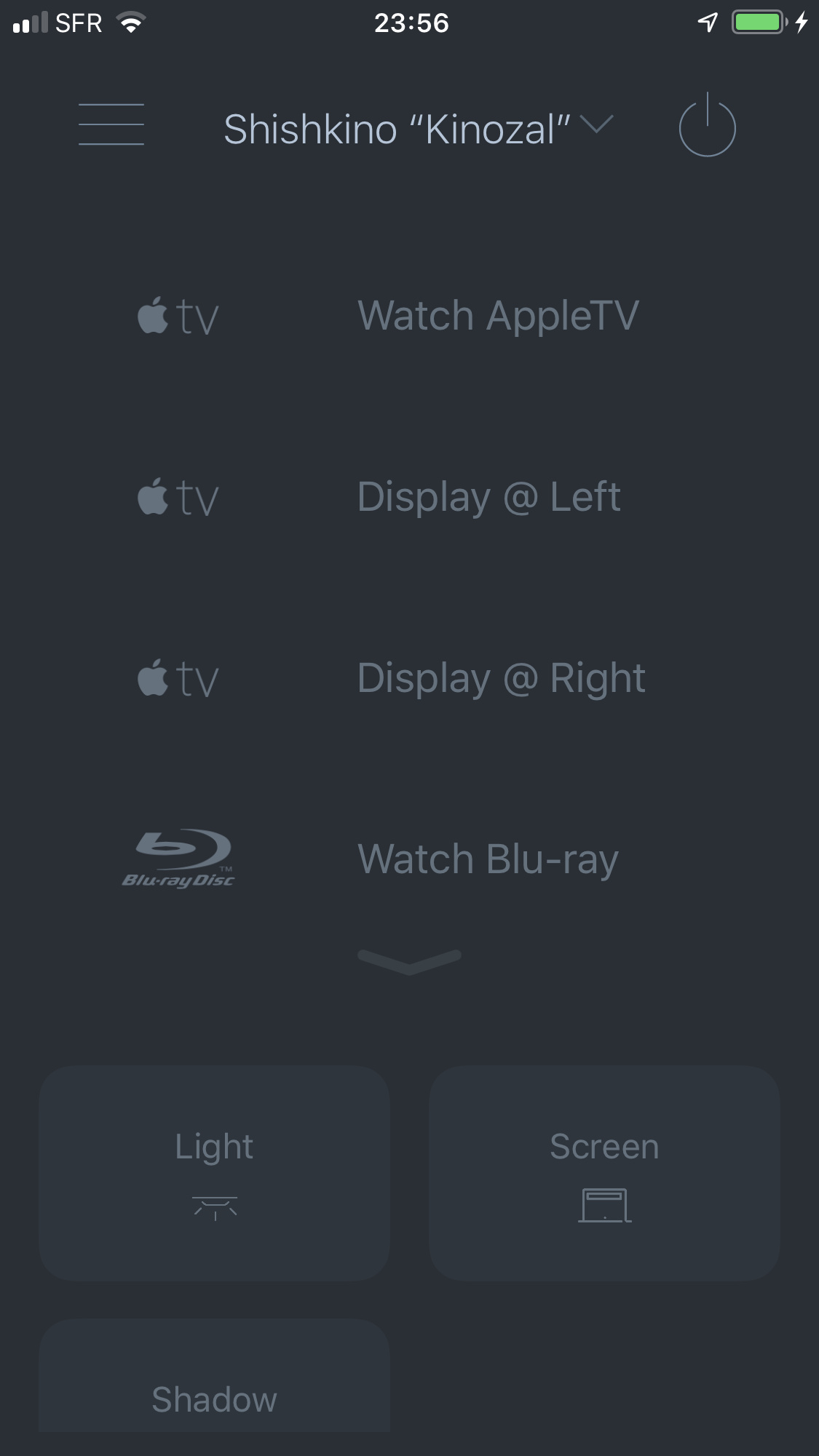
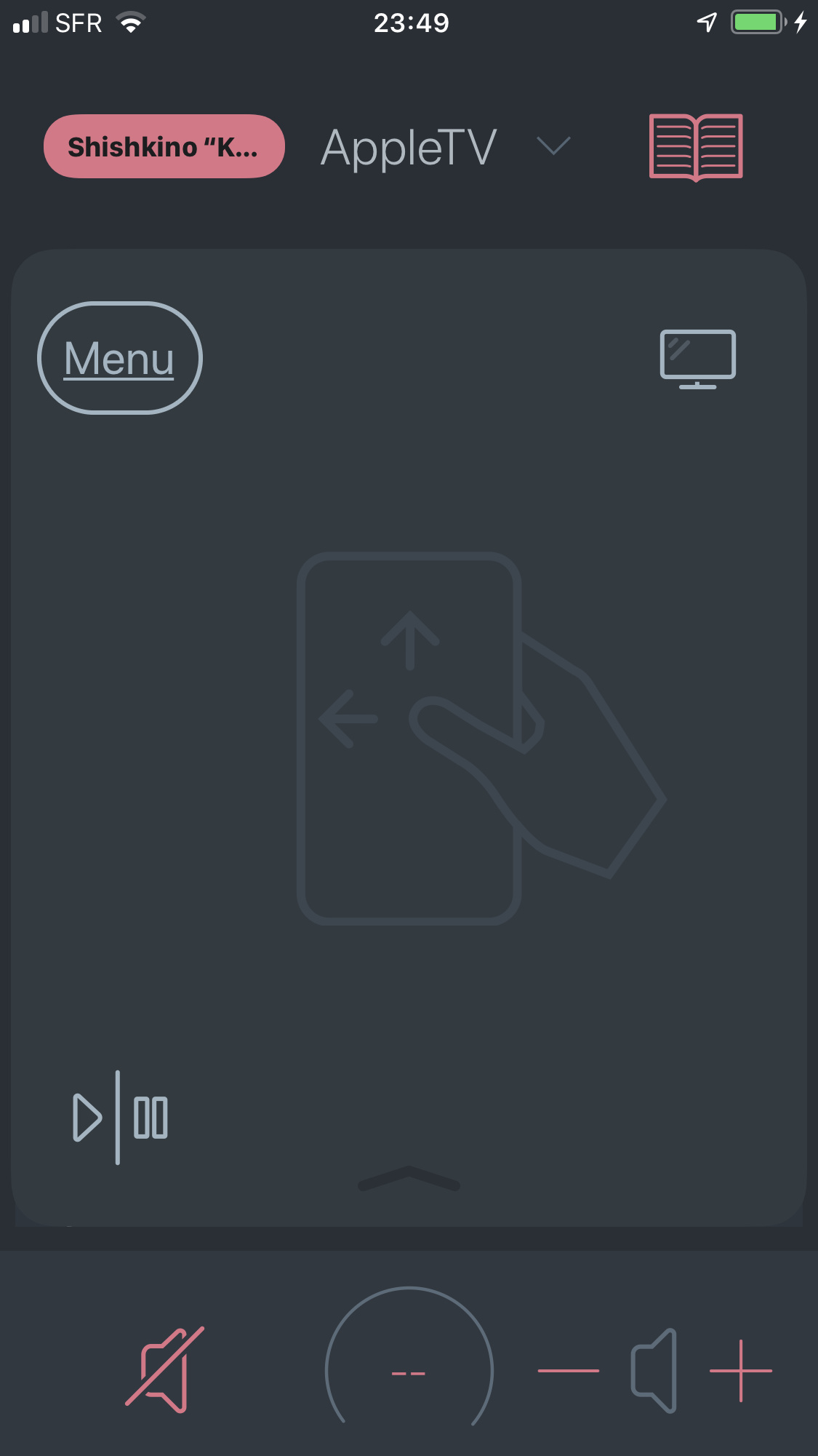
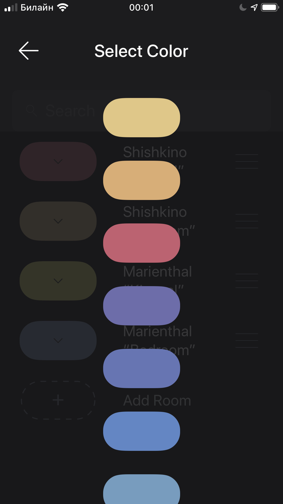
Greetings.
Is it possible to return the old color scheme?
Look at how in the old version everything was clear, beautiful and comfortable …
Old scheme:
New scheme:
Not sure what your point is. The actual contrast differential between V4 and V5 is basically inconsequential. If your point is that V4 was better on this front, the difference is so negligible that it must be very subjective or user-specific.
If what you want is high contrast or a dark mode like below, then I agree completely.
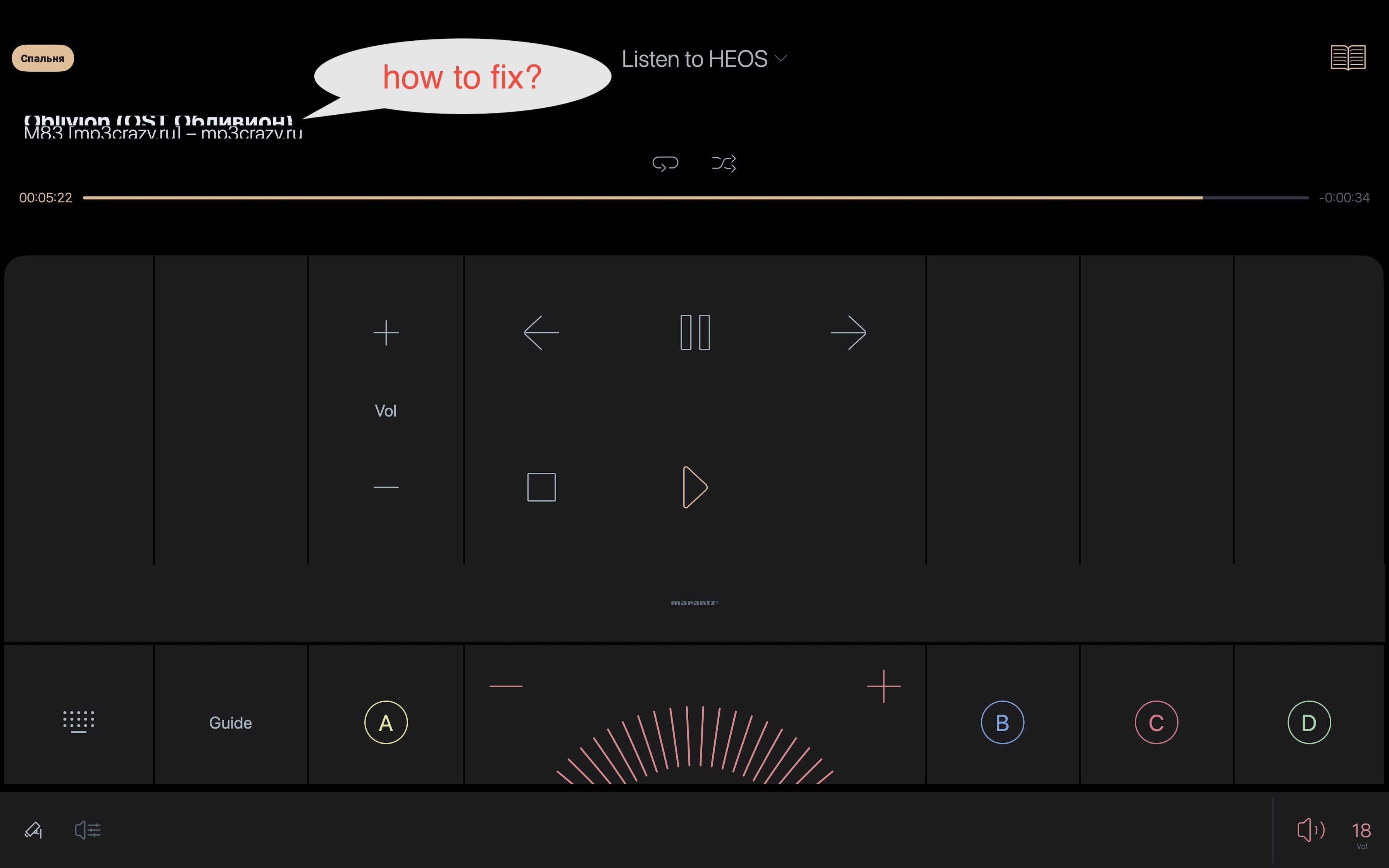
When muting the sound, the icon in the bottom panel does not cross out. Color change does not help, because the design is the same in color …
Please add pure colors without a gradient.